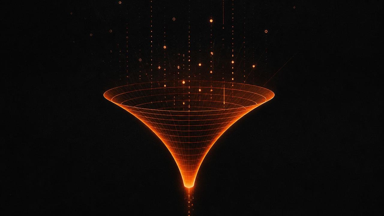

A high-converting landing page is not a pretty page: it is a sequence of decisions that eliminates doubt. This is the 12-block structure KCLOCK uses on lead-generation, launch, and e-commerce projects, with what to put in each block, what to cut, and how to validate before publishing.
What a high-converting landing page is
A landing page is a page with a single measurable goal: generate a lead, a sale, a booking. "High-converting" is the result of three alignments: the ad's promise, the page's message, and the intent of whoever arrived.
When these three are out of sync, no color palette saves it. When they align, the page converts even with a sober design. That is why the work starts with research and copywriting, not in Figma.
The 12-block structure
- Hero: a specific promise, a subheadline with a mechanism, and the main CTA.
- Immediate proof: logos, numbers, or a credibility badge right below the fold.
- Problem: name the pain using the customer's own words.
- Solution: how it works, in 3 to 5 visual steps.
- Benefits: result, not feature, each item anchored to a real consequence.
- Demonstration: screenshots, a short video, before and after.
- Deep social proof: testimonials with name, photo, segment, and number.
- Offer: what is included, terms, and what happens after the click.
- Objection handling: price, timeline, support, guarantee, "is this for me?"
- FAQ: the 5 to 8 questions sales hears most often.
- Final CTA: repeat the promise and a single path to action.
- Lean footer: no escape menu, just legal information and contact.
The hero: three seconds to convince
Visitors decide to stay or leave within a few seconds. The hero needs to answer three questions without scrolling: what this is, who it is for, and why now.
A headline formula that works
[Specific result] for [audience] without [feared obstacle]. Example: "Landing pages that turn paid traffic into booked meetings, without relying on a discount."
- Avoid institutional headlines ("Innovative marketing solutions").
- Use concrete numbers when they exist and are true.
- The CTA should describe what happens, not the effort ("See the diagnostic" beats "Submit").
Form, friction, and qualification
Every extra field lowers the submission rate. Ask only for what the sales team actually uses in the first contact and move qualification to later, whether in a second step of the form, the confirmation email, or the first call.
| Fields | Recommended use | Expected effect |
|---|---|---|
| 1 to 3 | Top-of-funnel capture and cold traffic | Higher lead volume |
| 4 to 6 | Mid-ticket services | Lower volume, more qualified leads |
| 7+ | Complex B2B enterprise sales | Low volume, high qualification |
Performance and Core Web Vitals
Speed is conversion. A page that takes too long to paint its main content loses the visitor before any sales argument gets a chance, and it also loses ranking in search.
- LCP: the hero image in WebP/AVIF, declared dimensions, and
fetchpriority="high". - CLS: reserve space for images, banners, and fonts to avoid layout shift.
- INP: fewer third-party scripts; load pixels after interaction when possible.
- Compress images, use
loading="lazy"below the fold, and avoid heavy carousels.
Publishing checklist
Do not publish without clearing these 12 items
- The ad's promise and the page's headline say the same thing.
- A single goal and a single type of CTA across the entire page.
- Social proof with name, photo, and a verifiable result.
- Main objections answered before the final CTA.
- Form with the minimum number of fields needed.
- Page tested on a real mobile device, not just in the browser.
- Images in WebP with declared width and height.
- Conversion events configured and tested in analytics.
- Thank-you page with a clear next step.
- Meta title, description, canonical, and Open Graph filled in.
- Contrast and keyboard navigation verified.
- The next test's hypothesis already logged.
Conclusion
High conversion comes from clarity, proof, and the absence of friction, in that order. Structure the page in blocks, measure every change, and keep it aligned with the sales funnel stage it serves.
Frequently asked questions about high-converting landing page
What is a high-converting landing page?
It is a page with a single measurable goal, free of navigation distractions, where the message, offer, and social proof are aligned with the intent of the traffic reaching it.
What is a good landing page conversion rate?
The market median sits between 2% and 5%. Pages well aligned with warm traffic can exceed 10%. The number that matters is your own history: improving from 2% to 3% means 50% more revenue with the same investment.
How many fields should the form have?
Ask only for what the sales team uses in the first contact. Usually name, email, and WhatsApp are enough. Every extra field lowers the submission rate; qualification fields can live in a second step.
Does a landing page need a navigation menu?
No. Navigation links create alternative exits and lower conversion. Keep only the logo, the offer, and CTAs pointing to the same action.
Landing page or institutional website: which converts more?
For paid campaigns, the landing page converts more because it responds exactly to the ad's promise. The institutional website serves brand intent and broader navigation.

About the author
Yara Iencius
Partner and Head of Design & UX, KCLOCK
Conversion designer. Responsible for UX/UI, interfaces, landing pages, and e-commerce sites that turn strategy into a high-converting experience.
- #landing page
- #conversion design
- #copy
Want to apply this to your funnel with people who do it every day?
KCLOCK builds high-converting funnels, landing pages, websites, and e-commerce stores. We diagnose your current funnel and show you where the revenue you're leaving on the table is hiding.